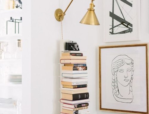
Art has a special place in the home, and the way we display it can change its meaning and impact on those who enjoy it day in and day out. Displaying artwork is one way I keep my home fresh, and more recently I completed a gallery wall in my living room, consisting of 12 framed prints and some pictures. I’m pretty happy with how it came together! Now, I’m no stranger to planning and executing these types of projects, but this recent creative endeavor was a seemingly effortless project thanks to selecting all same-colored frames. I also think it would have been helpful to have the same-sized frames! This makes for a much easier measuring and planning session from the get-go. But here’s a pro tip: no matter what size or shape of images you choose, you still need to measure and mark the walls before hanging! I’ve learned this the hard way.
Since I often receive so many questions about gallery walls on Facebook, I thought it was time to round up 12 of my favorite collections to fuel your very own gallery wall weekend project.
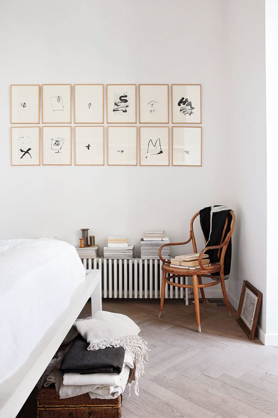
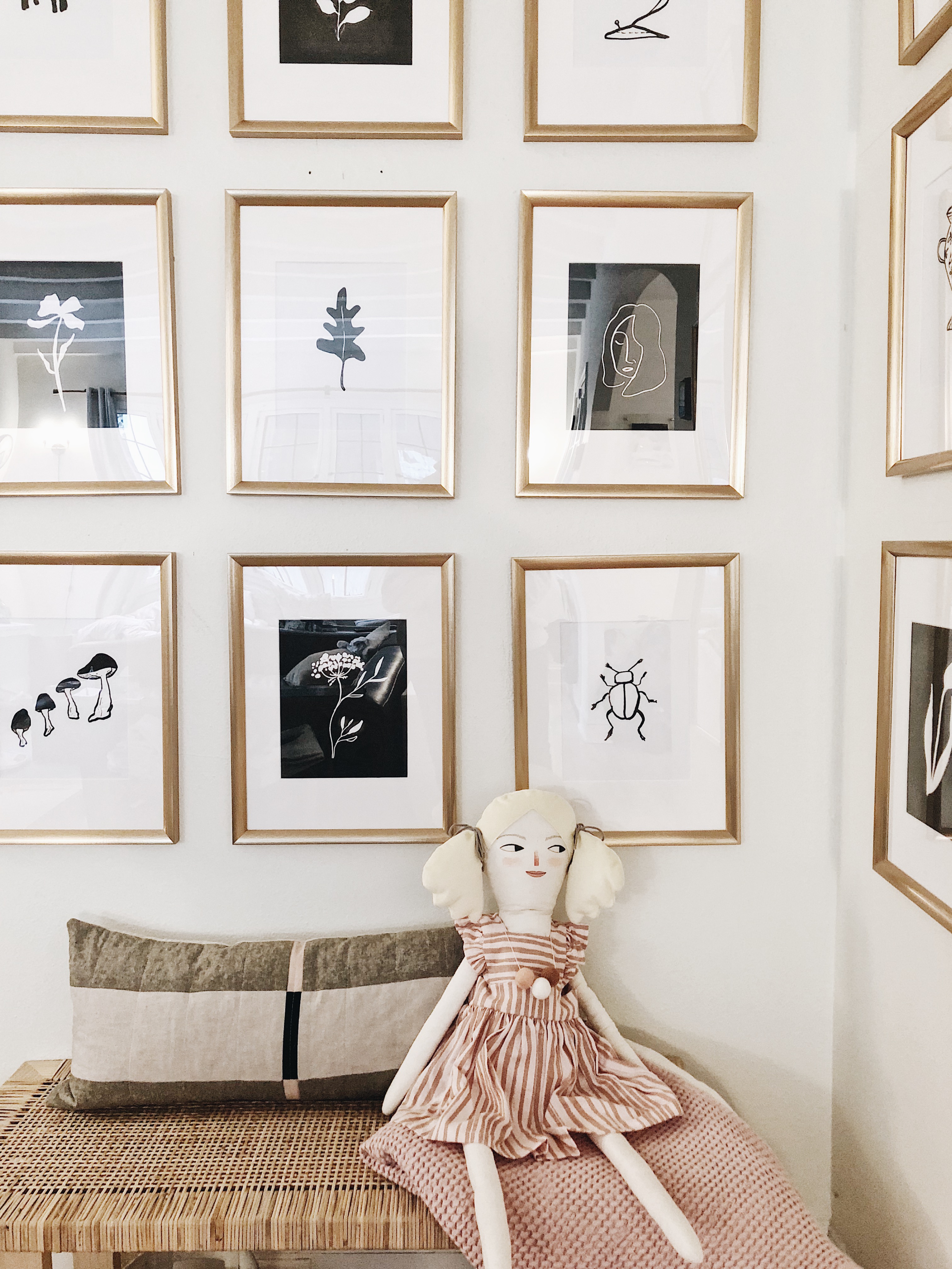
The uniform grid might be the easiest of the bunch to attain, as you only need to choose one consistent frame and medium. This monochromatic assortment is simple- there is little room for error aside from not measuring correctly!
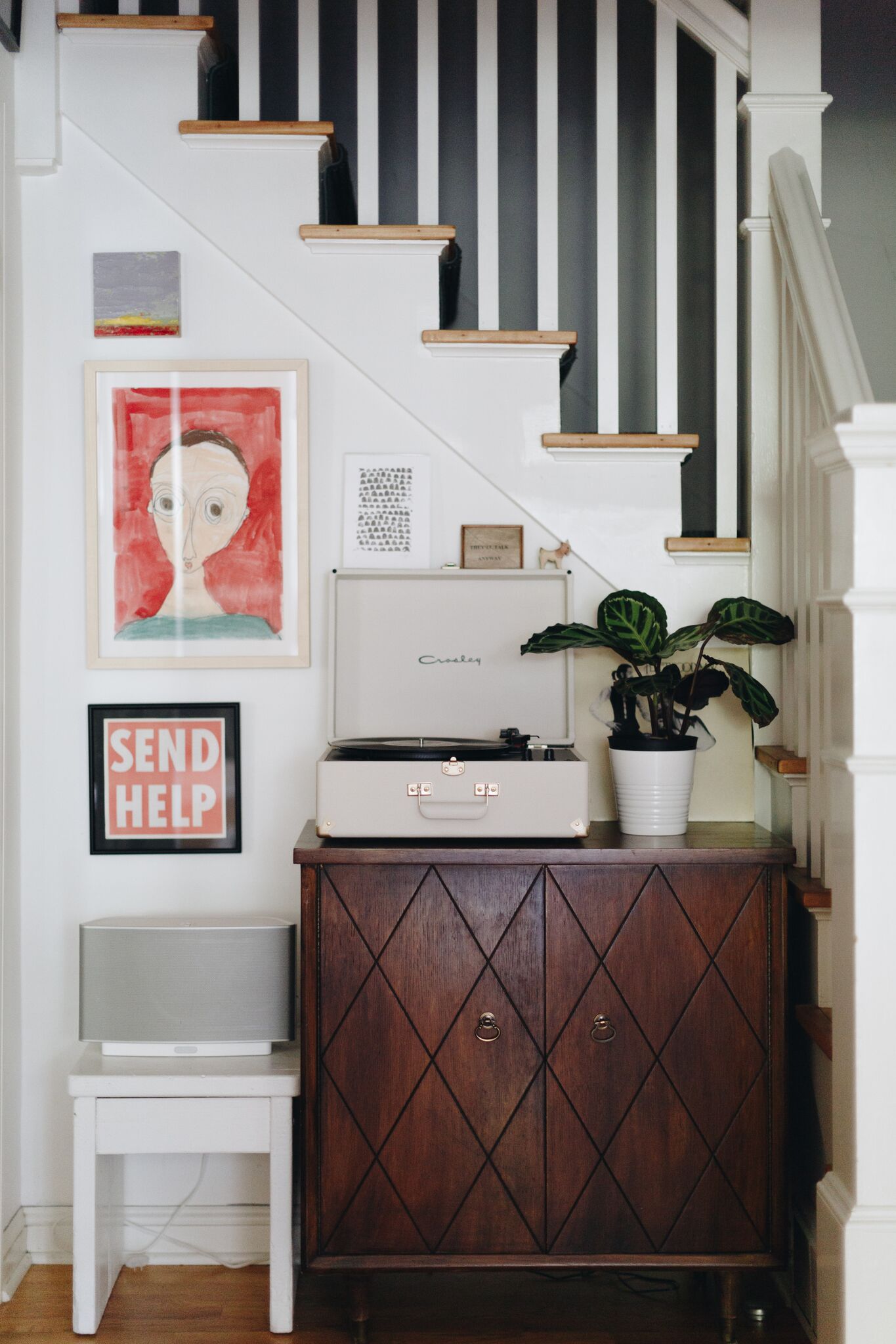
Looking for an out-of-the-box way to display your kiddo’s latest art creations? Frame their masterpieces, find some blank wall space, and play around with the layout until you find the right fit! I’m looking forward to recreating this look down our basement stairs when I have more free time.
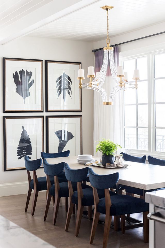
I wish I had the wall space for a bold, more formal look like the dining room shown above. If you have the space, go for it by hanging four large prints in a grid format using a consistent frame. If you’re anything like me, your brain will appreciate the symmetry!
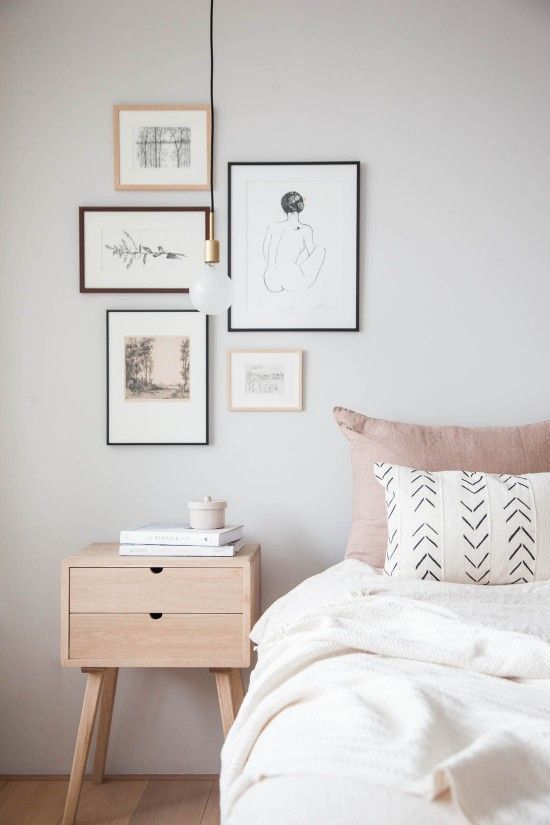
For a minimalistic gallery, frame your pieces with an unassuming border and a neutral color palette. Here’s an easy tip: to pull an assortment together, apply a mat to each print you intend to display. The consistency will keep your collection from looking cluttered.
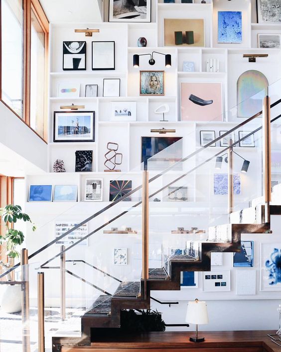
Okay, so this one is a showstopper. Even if you don’t have an epic staircase, there is a lot to take away from this space! To establish this modern, yet artistic and eclectic vibe, turn the biggest wall space in your home into a gallery wall from top to bottom. Get creative and experiment with different frames depending on the art or print. Guests will feel as though they’re walking into a museum each time they visit! I love how they also built shelving into this gallery. So cool.
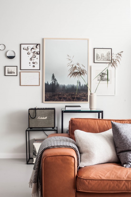
If you’re looking for a more organic feel, choose pieces varying in size and let one large print serve as the focal point of the collection. Don’t limit yourself to just prints and photos, hang simple treasures for added dimension.
This is the gallery wall I recently designed in a client’s space. I opted for gold vintage frames that bring their hand-drawn prints to life.
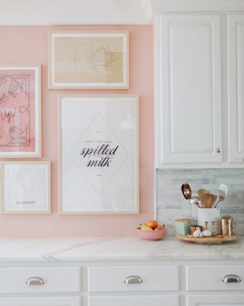
To showcase a little taste of your personality, select a handful of wall art and/or prints that reflect you. Don’t be afraid to hang your collection against a bright-colored backdrop like the candy-pink above! The accent will amplify your art.
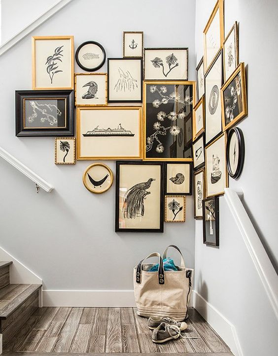
This one is a favorite of mine. For a non-traditional gallery, find an unexpected corner or area in your home to hang your frames. Play around with different orientations with a diverse mix of horizontal, vertical and square. You can also add some drama by placing the frames super close together, so they read as one piece instead of a bunch of individual frames.
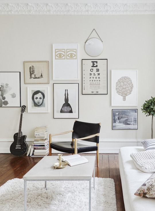
Modern doesn’t always necessarily need to mean minimal. For a contemporary and clean gallery, incorporate classic colors like black, white, and a pop of metallic. Prints with more negative space will feel less chaotic and lighter. This space also shows that posters aren’t just for dorm rooms.
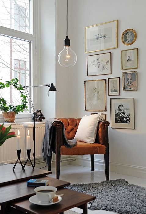
I’m a sucker for vintage pieces found at the back of the antique store. I suggest putting them to good use by displaying old family photos in antique frames for a meaningful yet beautiful and nostalgic gallery wall.
________________________________________________________________________________________________
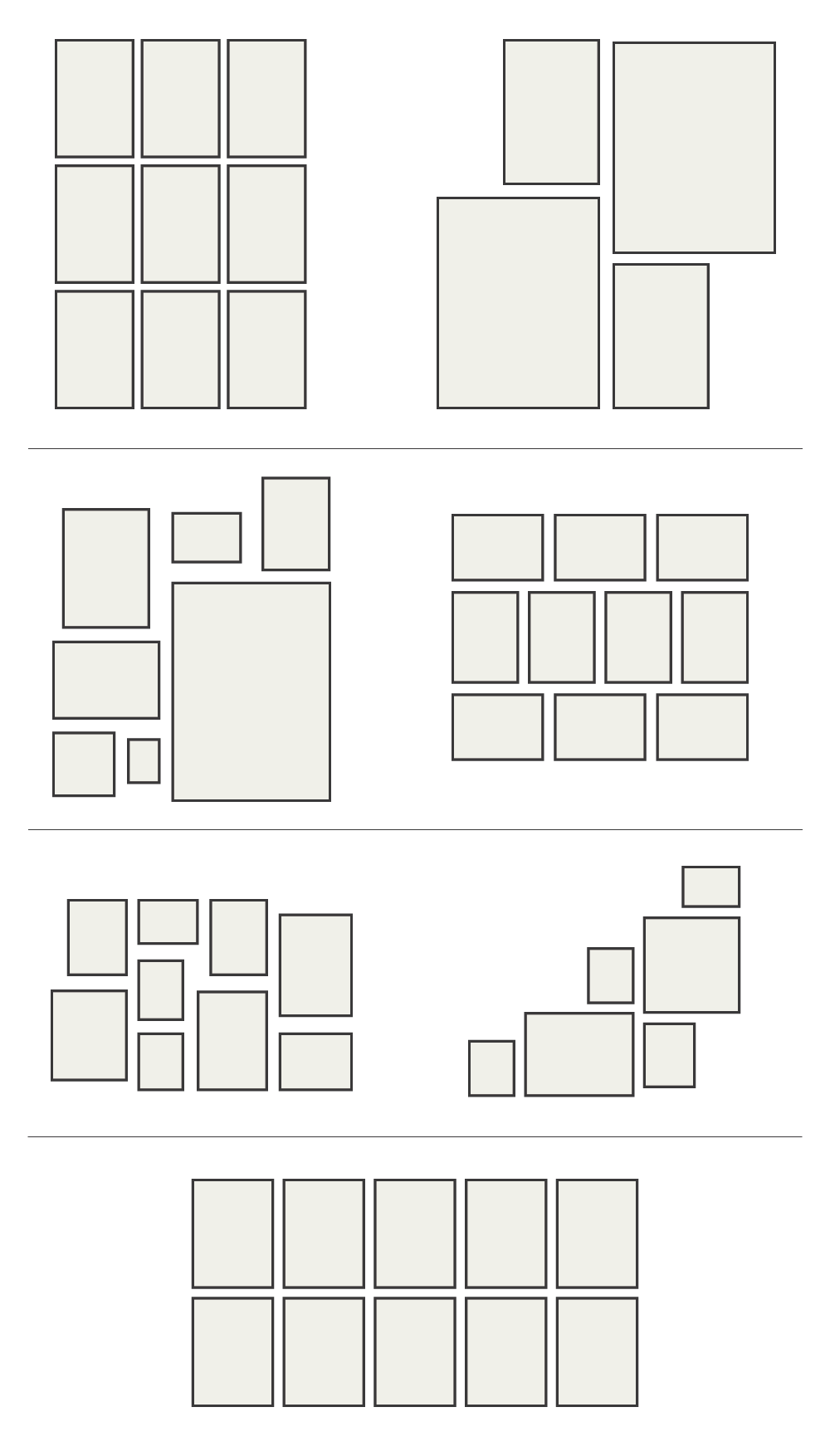
Some of my favorite layout ideas!
Which one is your favorite? Are you more of an orderly grid person or do you like a mix of different shapes and sizes? Happy hanging, guys!
Image sources: 1 / 2 / 3 / 4 / 5 / 6 / 7 / 8 / 9 / 10 / 11 /

