Home stagers, realtors, and even home owners argue over this point all the time. So today I am sharing my two cents on whether or not dining tables should be set when staging a home.
Generally, when you’re staging your home to put on the market, I recommend that you avoid setting the table, instead keeping the focus on the space, not your stuff. That is, after all, the entire concept behind staging to sell. You aren’t selling your stuff, you’re selling the house! So why add yet another distraction?
Potential buyers walk through a home in about 15-20 minutes on average. By setting the table, you are now taking away from their experience of the space by directing them to the tabletop instead of the beautiful outdoor view, shiny hardwood floors, or gorgeous chandelier.
While a smartly dressed table can be amazing to look at, remember what you’re selling…THE HOUSE! So dress your table for a celebration or holiday, not for a showing. Keep that colourful bouquet on the table to draw the buyer’s eye into the room, but don’t over-indulge. You want to ensure that potential buyers remember the space itself, not your grandma’s china!
There are exceptions, though…
In my 10 years in the industry, I’ve only set a table twice in hundreds of home staging projects!
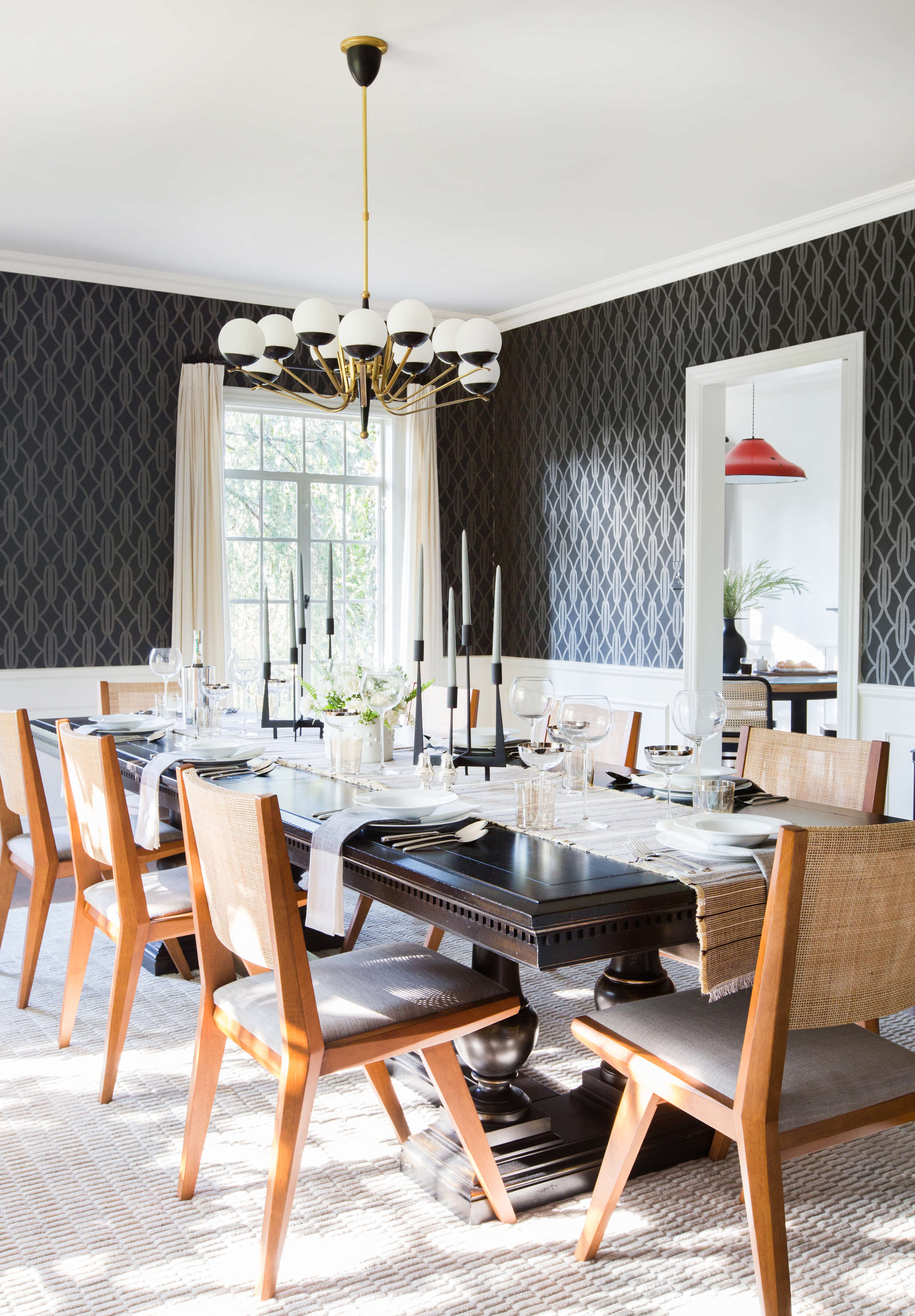
In both cases it was because it was a very high-end home with a large dining room. I wanted to showcase how elegant and comfortable a sit-down dinner with many guests could be. After all, this would be an impossibility in most homes.
We used the client’s fine china and glassware for home staging.
I felt it was especially important to set the dining room table in these homes because their layouts made them ideal for entertaining. Plus, the target market for such high-priced, conservative homes in these “old money” neighbourhoods was senior executives and their families. They would most likely want to do some serious business and personal entertaining.
But again, in smaller dining rooms, I’m not a fan of setting the table for home staging. I think it’s distracting to see plates and glassware when the table top visually takes up most of the room.
In my opinion, setting a breakfast island looks too gimmicky. It’s clear what a breakfast island can be used for so I don’t think it’s necessary to set up a contrived meal scenario. Of course, if the counter top is really ugly, you can break it up a bit with placements, cereal bowls, etc.
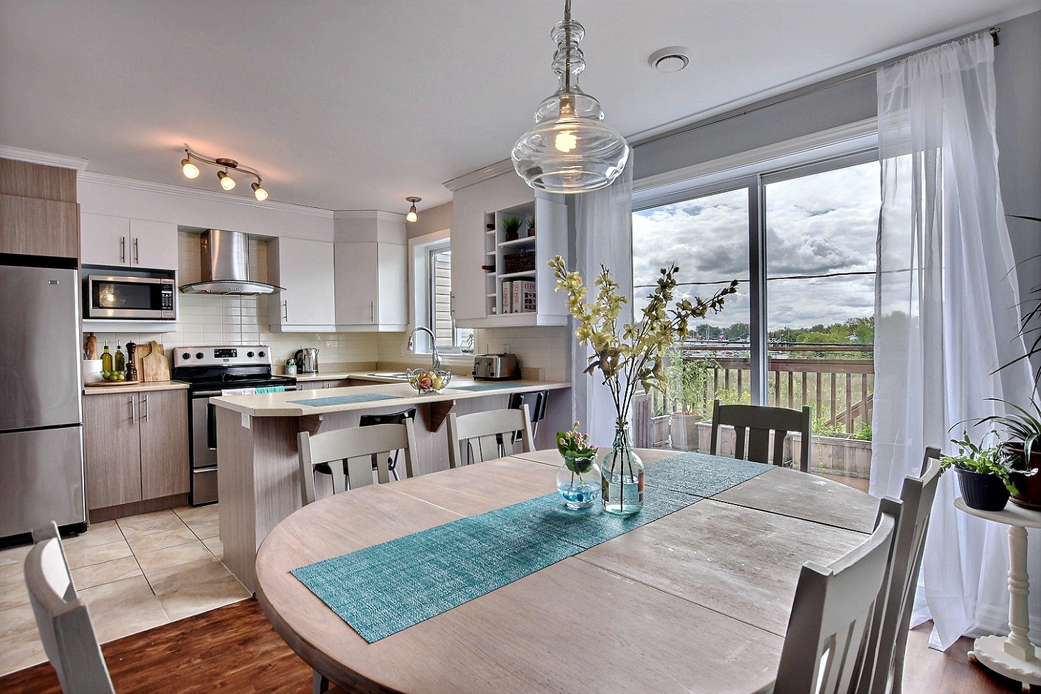
As a general rule, when staging typical family homes, my preference is a nice centrepiece on a dining table rather than going with place settings. I generally use a bowl of fruit on a kitchen counter and a simple flower arrangement on the kitchen table.
Overall, you could say I’m not a fan of setting the table for home staging. There will undoubtedly be different opinions on this and I’d love to hear thoughts. Please share your experience or point of view in the comments below!

