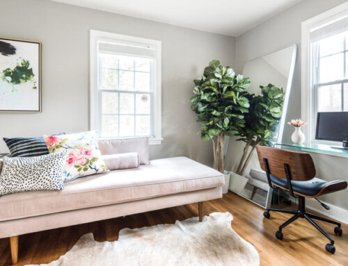
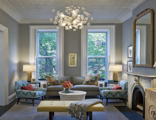
Fun fact – interior designers notoriously have a hard time selling their own homes. You see, we tend to think our style and decoration choices are great for everyone and that we don’t need to change a thing for an open house. But that is not always the case, which is why people hire staging companies.
But I am first and foremost a home stager, even before being a designer, and I felt capable of being level-headed about making staging decisions in my home.
Thus, I launched the “How We Staged Our House To Sell” series a few weeks ago.
If you missed it, you can find out how we staged:
My goal is to make the house feel big, airy and beautiful, but in a really simple way. We, like most people, want top dollar for this beauty, so it needs to appeal to as many people as possible.
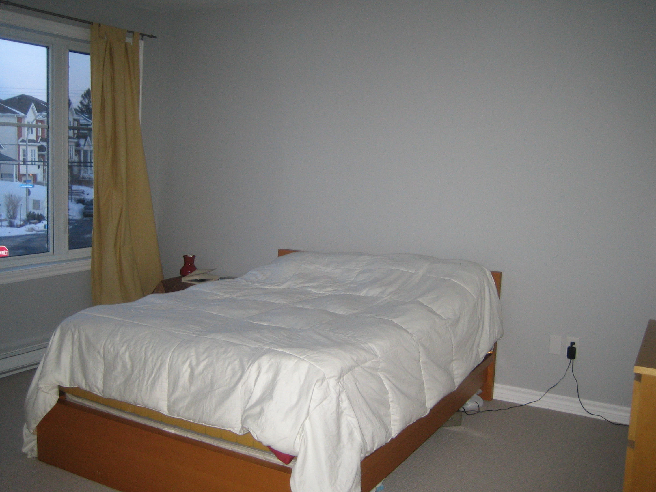
And so today I’m presenting the master bedroom! Previously it looked like this (don’t laugh):
When we first bought our home in 2009, our bedroom looked like the picture above! We shared my husband’s Ikea Malm double bed, and any time either of us moved, it led to marital conflict!
This room was one of the last ones to be updated simply because no one was allowed in it!
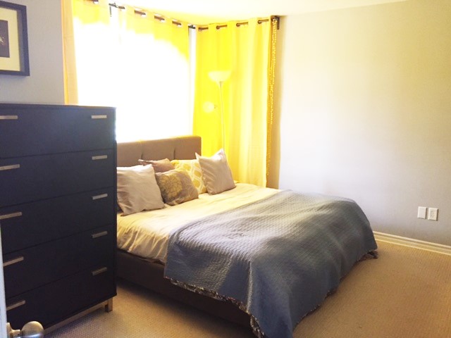
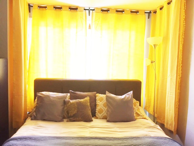
When I got pregnant and got more and more uncomfortable sleeping, I convinced my husband to upgrade our bed. We FINALLY got a king size bed! It was bliss!
I wanted a cozy feel in the room, so we moved the bed in front of the window
You can’t tell from these pictures, but the dresser and side tables were all along the wall across from this one.
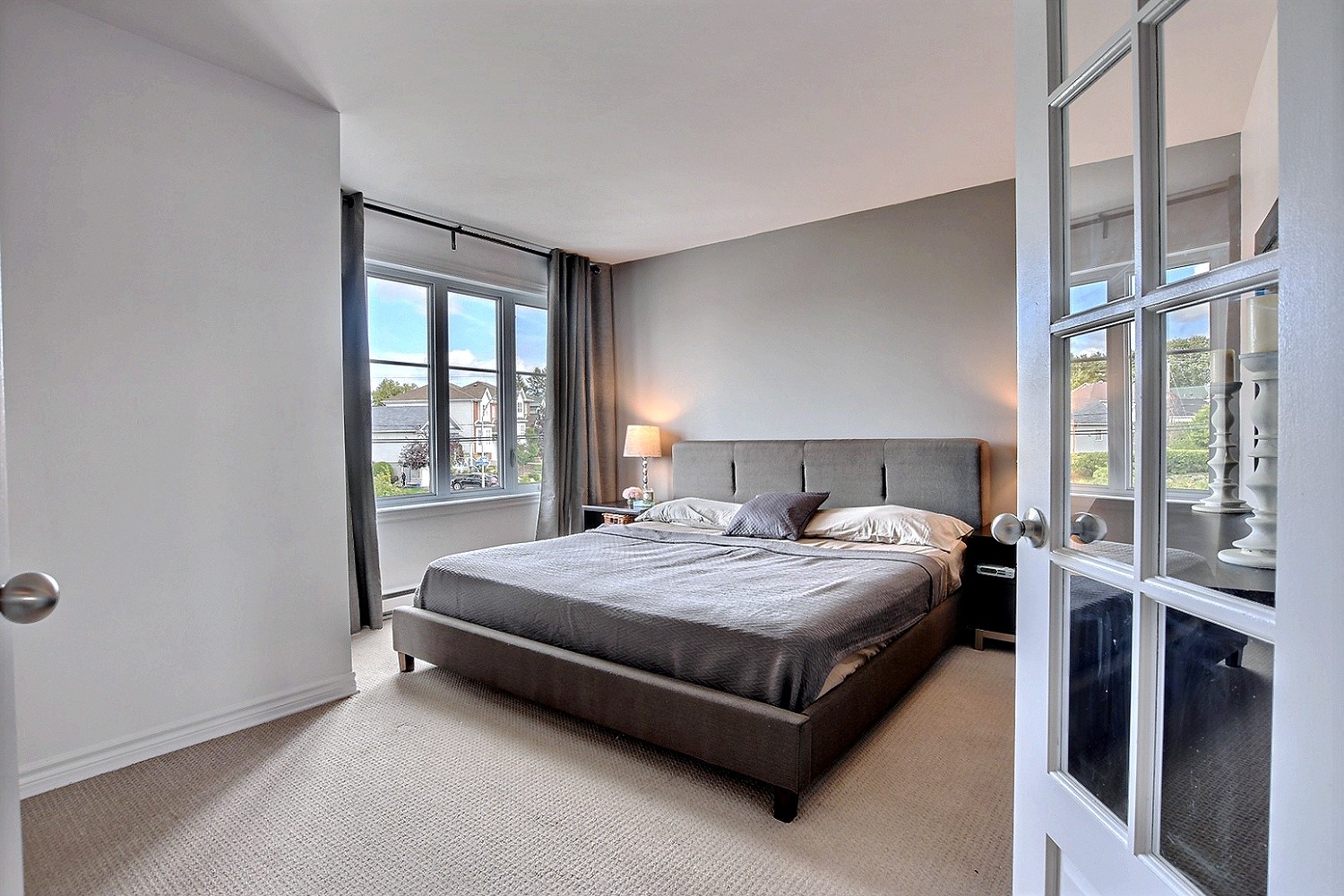
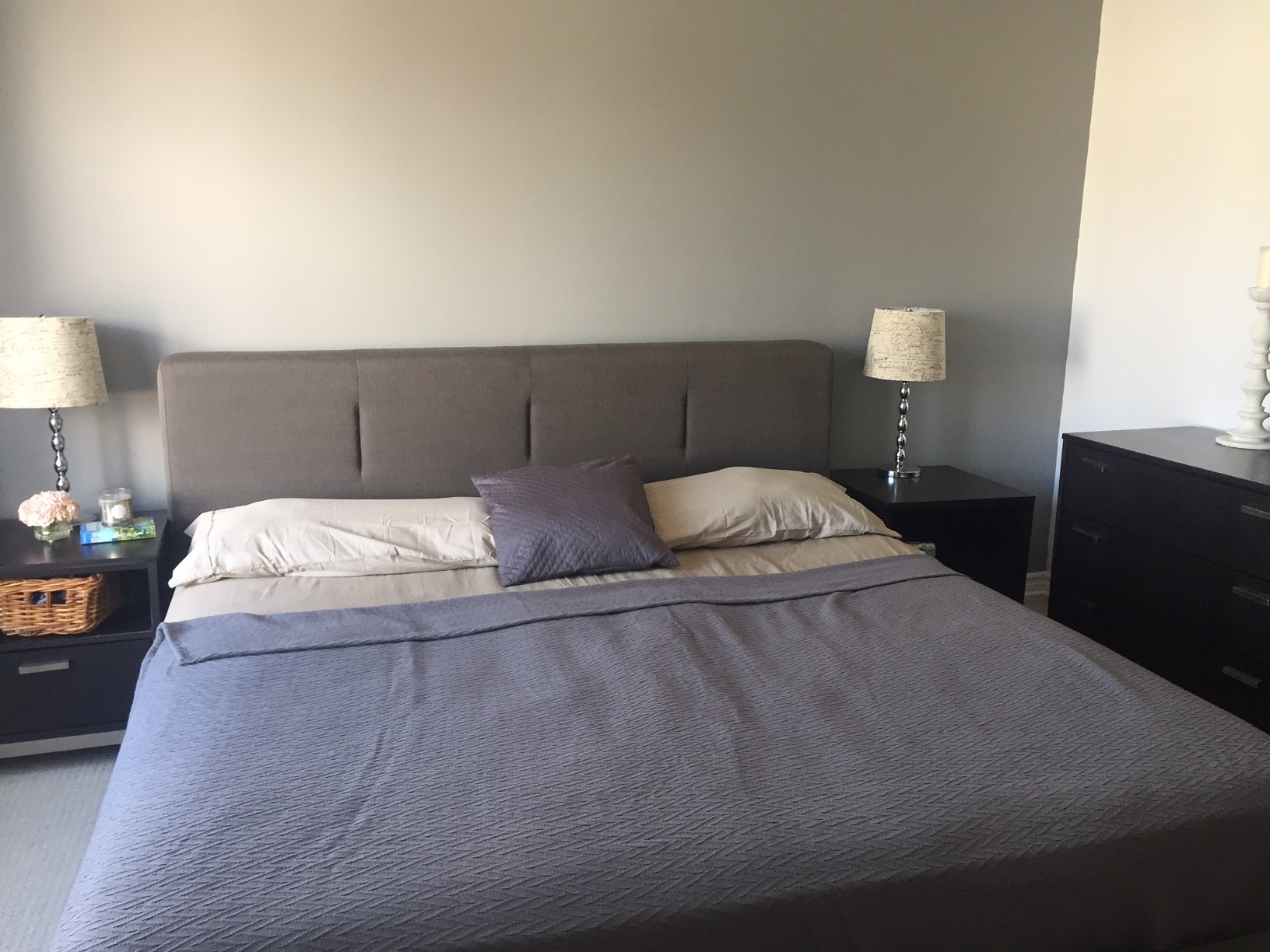
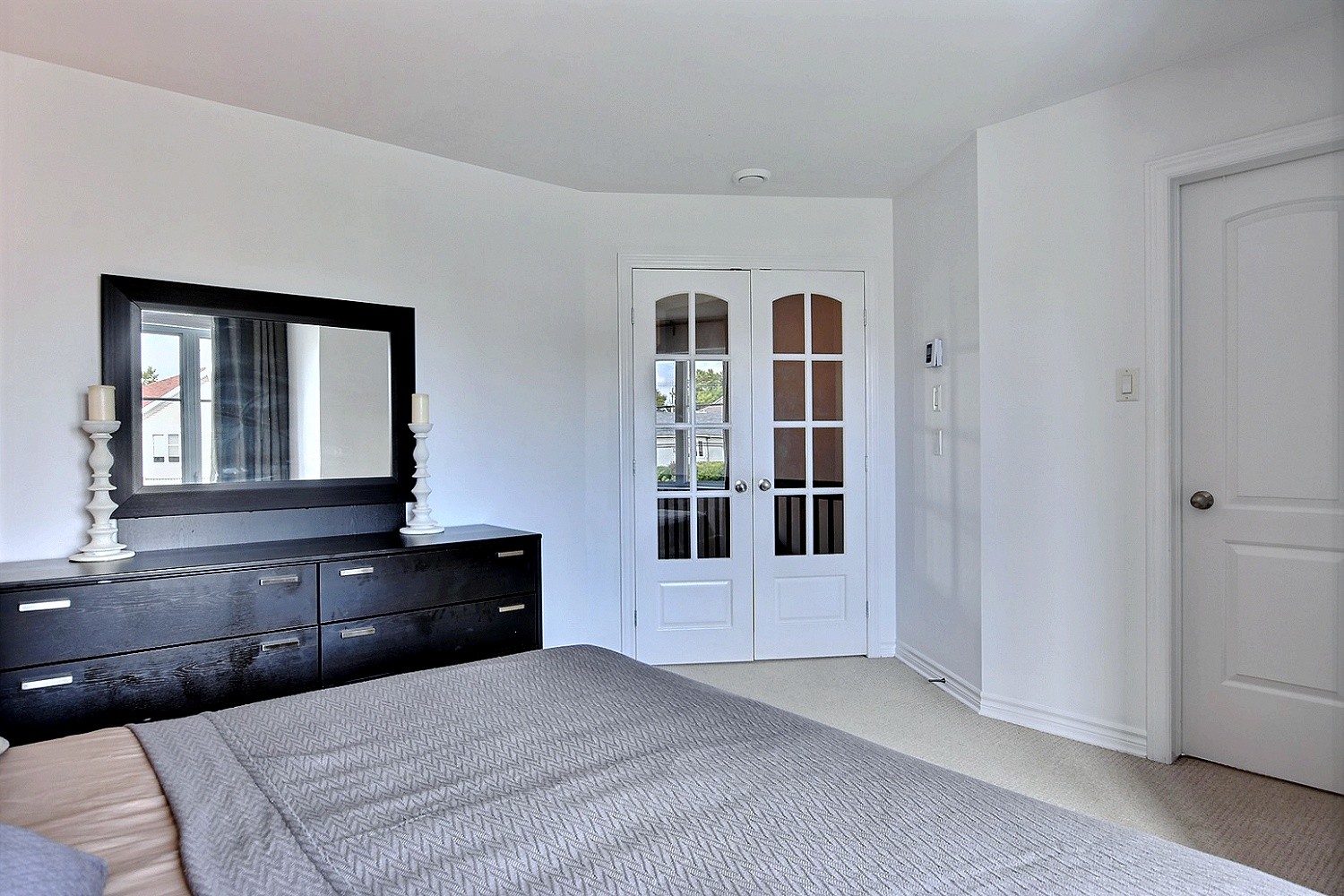
However, when it came to staging, this layout is not ideal. It makes the room feel smaller, and the tall dresser is too bulky for the space. So staging our bedroom mainly consisted of painting just to refresh the room (we painted it all white except one focal wall), changing the furniture layout to maximise the space, and especially removing the tall dresser (we put it in our basement). We also replaced the curtains for a more neutral option.
Overall, we kept it calm and simple! What do you think?

