As you might know, our house will be on the market shortly.
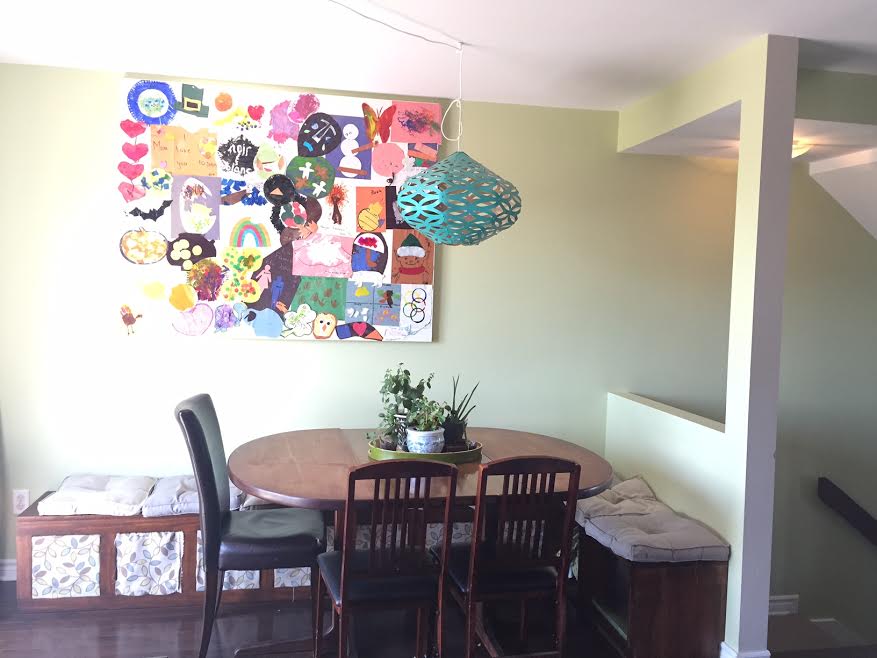
I’ve decorated it a few different ways over the years, at some points loving it more than others. But lately it was at its best for our personal use.
We liked having the bench! It made entertaining super easy and provided lots of storage. It also left the back patio door accessible.
BUT… The way we live and the way we sell are very different.
What’s wrong with this dining room, you might ask?
It’s important to remember that when staging a home, you need to show off the spaciousness of a room. Buyers need to be able to move around the room and not feel blocked into a space. Also, you want buyers to imagine themselves in the space. In our dining room, the highly personalised collage of Ezra’s artwork had to go.
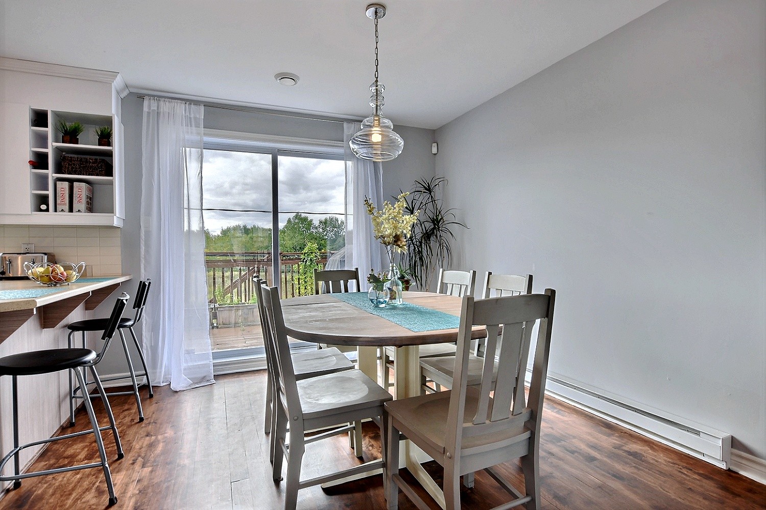
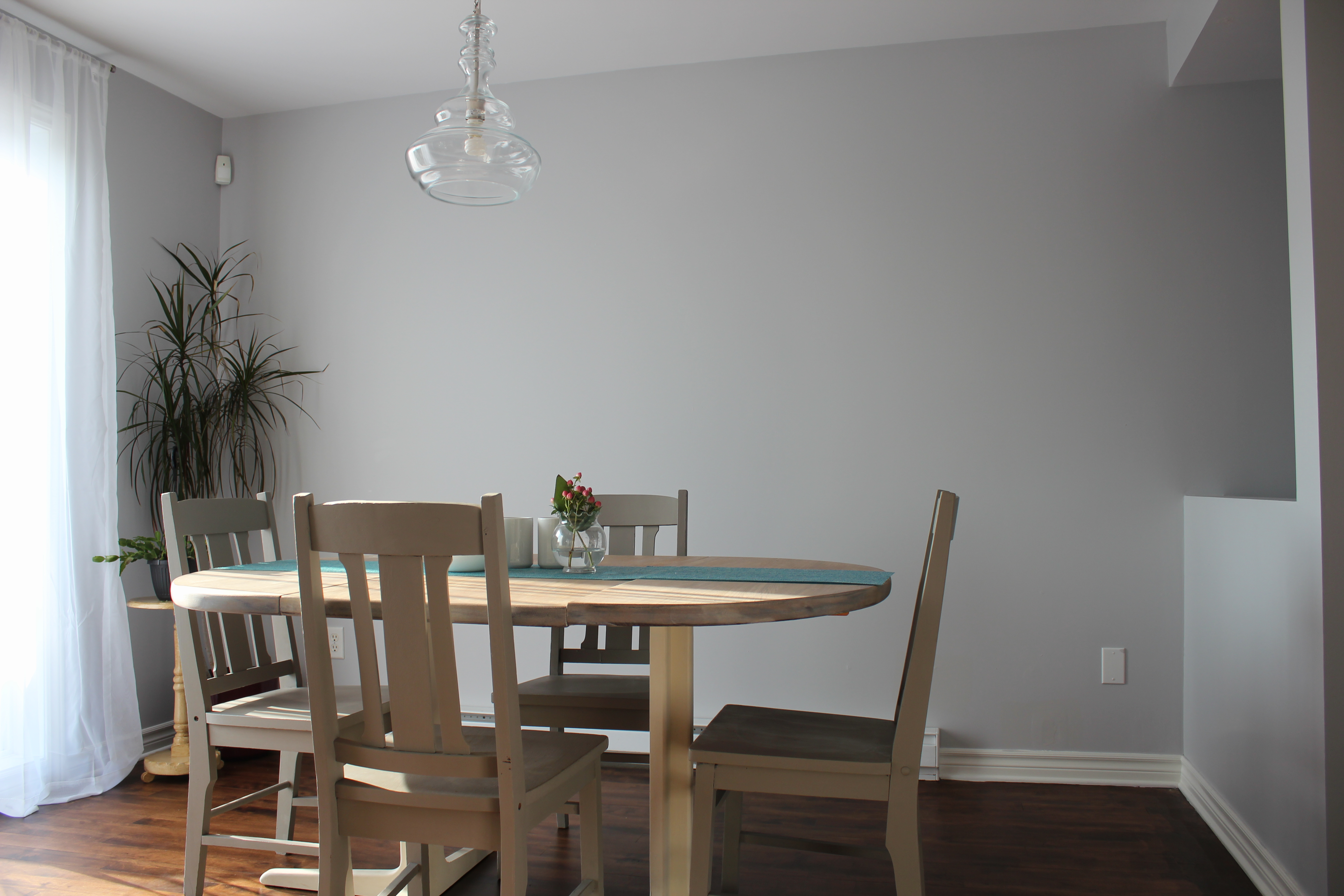
So to appeal to a larger audience and display the dimensions of this room, we neutralised the paint colour and moved our table back into the centre of the room. We replaced the light fixture for a more neutral model and obviously removed the collage from the wall.
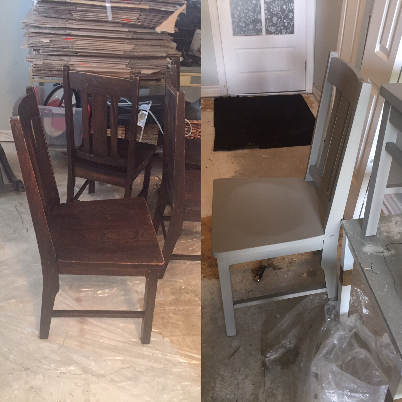
I reused the table that was already in good condition and a good size for the room… I painted the legs white to go with the trim and baseboards, and I sanded and stained the top of the table with whitewash. I had some chairs in storage that were the wrong colour, so I painted them with Annie Sloan’s French Linen Chalk Paint.
A few simple tricks to make a dining room appeal to more people! Here’s what it looks like now:
This dining room is simple, uncluttered, has a little pop of colour, and we’ll probably add two more chairs along the wall to show the space available.

